Icon-Based Verification Flow
An icon-based onboarding flow designed to minimise reading load and create a more accessible experience.
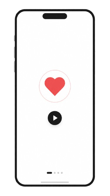
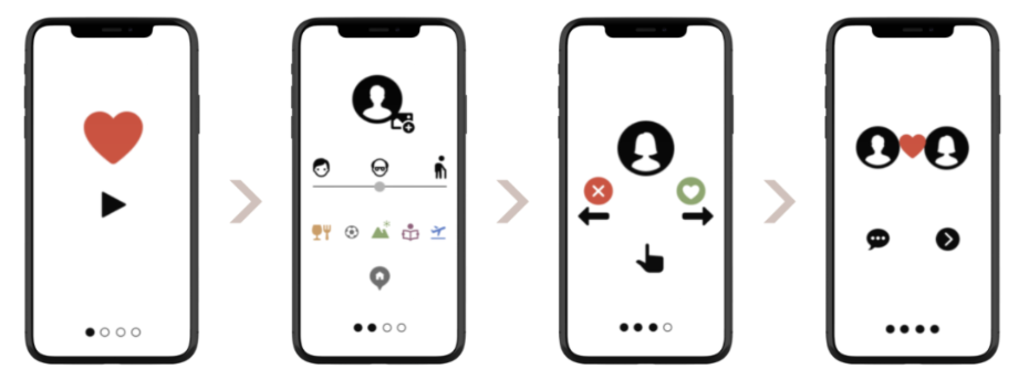
The project aimed to design a verification and onboarding flow accessible to all users, regardless of reading ability or language skills. By replacing text-heavy instructions with clear icons and visual cues, the flow becomes intuitive and easy to follow.
The work included research, ideation, wireframing and interactive prototyping in Figma. The focus was on finding the right balance between icons and text to guide the user without creating confusion.
Problem
Text-heavy onboarding flows create barriers for users with reading difficulties or limited language comprehension.
Solution
An icon-based flow that replaces text with visual cues, creating a more inclusive and accessible experience.
✦ Wireframes
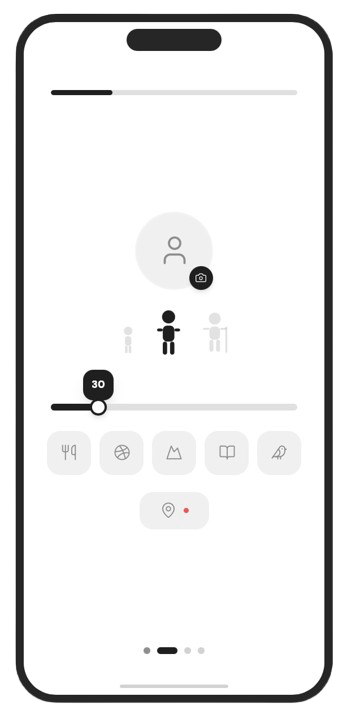
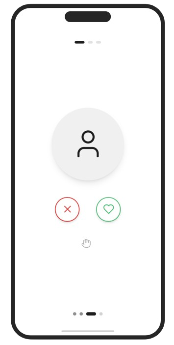
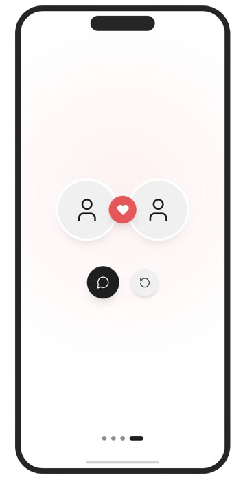
Process
Research
The project began with an analysis of existing onboarding flows and accessibility guidelines. Interviews and research into user needs helped identify the biggest barriers in text-heavy flows and what is needed to make them more inclusive.
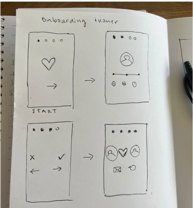
Wireframes
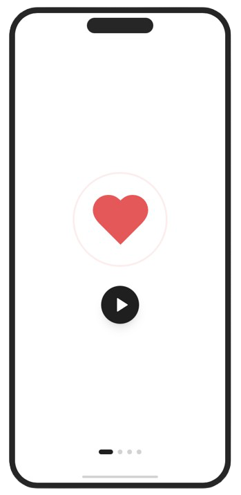
Early sketches and wireframes tested different ways to communicate verification steps using icons. Several alternatives were evaluated to find the combination of icon and short label that was clearest and most intuitive for the user.
Testing & Iteration
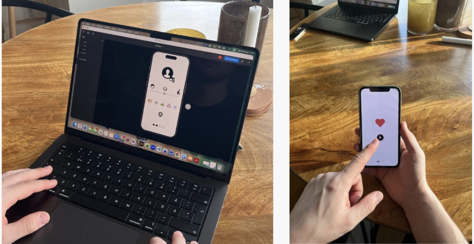
The prototype was tested with users to evaluate how well the icons communicated the correct action without text. The feedback was used to iterate and refine the flow, particularly around icon selection and how much supporting text was needed to maintain clarity.
Design
UI Design
The design was inspired by accessibility-adapted interfaces and modern onboarding flows with strong iconography. The goal was a clean, stripped-back aesthetic where the icons carry the communicative responsibility and create a calm and trustworthy experience for the user.






Learnings
Outcome & Reflection
The project showed that icon-based flows can be very effective at lowering the threshold for users with reading difficulties, but that icon selection is complex and requires user testing. An icon that seems obvious to a designer can be confusing to another user.
The work strengthened my knowledge of accessibility design, iterative prototyping and the importance of testing early with real users rather than relying on assumptions.